Creating a Custom Solana Connect Wallet UI with React and Chakra UI
If you have worked with the Solana Wallet Adapter before, you will know that it is very easy to set up a Connect Wallet button with a decent modal.
However, customization is pretty limited. We can only add some custom CSS hence changing the styles but that is about it. In this article, we go over the following:
Understanding how the
@solana/wallet-adapter-react-uipackage worksUsing the
@solana/wallet-adapter-reactpackage to create a custom Connect Wallet page
You can check out the deployed version of what we are going to build here
Let's get started!
How does @solana/wallet-adapter-react-ui work?
If you go through the source code for the React UI package, then you will notice that it makes use of the useWallet hook from the @solana/wallet-adapter-react package. It also has the required components (buttons, modals, providers) and styling to be an easy-to-use library to implement a connect wallet feature.
The useWallet hook
The useWallet hook returns functions like select, connect, and disconnect to select a wallet, connect to the selected wallet, and disconnect from the connected wallet respectively. It also returns some variables - wallets which is a list of all wallets with their availability status, wallet which is the currently selected wallet, publicKey, connecting, connected, and disconnected telling us about the current connection status.
Using @solana/wallet-adapter-react to create a custom Connect Wallet UI
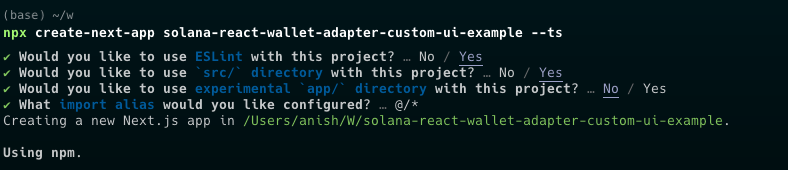
Let us start by creating a new Next.js project -
npx create-next-app solana-react-wallet-adapter-custom-ui-example --ts
It will ask you for some prompts, you can accept the defaults for this guide.
Now open up the project in your favorite IDE and open up the terminal. Then enter the following command to install the required dependencies -
npm i @solana/web3.js @solana/wallet-adapter-base @solana/wallet-adapter-react @solana/wallet-adapter-wallets
For this guide, I am going to be using Chakra UI for styling. To install the required dependencies for Chakra UI, run the following command -
npm i @chakra-ui/react @emotion/react @emotion/styled framer-motion
Now replace _app.tsx with the following -
import "@/styles/globals.css";
import type { AppProps } from "next/app";
import { ChakraProvider, extendTheme } from "@chakra-ui/react";
import {
  ConnectionProvider,
  WalletProvider,
} from "@solana/wallet-adapter-react";
import { useMemo } from "react";
import {
  GlowWalletAdapter,
  PhantomWalletAdapter,
  SolflareWalletAdapter,
  MathWalletAdapter,
} from "@solana/wallet-adapter-wallets";
import { clusterApiUrl } from "@solana/web3.js";

const theme = extendTheme({
  config: {
    initialColorMode: "dark",
  },
});

export default function App({ Component, pageProps }: AppProps) {
  const wallets = useMemo(
    () => [
      new PhantomWalletAdapter(),
      new SolflareWalletAdapter(),
      new GlowWalletAdapter(),
      new MathWalletAdapter(),
    ],
    []
  );

  const endpoint = useMemo(() => clusterApiUrl("mainnet-beta"), []);

  return (
    <ConnectionProvider endpoint={endpoint}>
      <ChakraProvider theme={theme}>
        <WalletProvider wallets={wallets} autoConnect>
          <Component {...pageProps} />
        </WalletProvider>
      </ChakraProvider>
    </ConnectionProvider>
  );
}
We are setting up the ConnectionProvider and WalletProvider from @solana/wallet-adapter-react with the default Solana mainnet RPC URL and 4 wallets - Phantom, Solflare, Glow and Math Wallet (this is to demonstrate how the wallets list includes the wallet availability status).
Now replace index.tsx with the following -
import { Container, Heading, VStack } from "@chakra-ui/react";
import { useWallet } from "@solana/wallet-adapter-react";

export default function Home() {
  const { wallets } = useWallet();

  console.log(wallets);

  return (
    <Container as="main" mt={32} maxW="3xl">
      <VStack w="full" gap={8}>
        <Heading textAlign="center">
          Solana React Wallet Adapter Custom UI demo with Chakra UI
        </Heading>
      </VStack>
    </Container>
  );
}
Run npm run dev and go to http://localhost:3000/ on your browser. Open up devtools and look at the console -
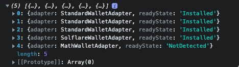
I have Backpack, Glow, Phantom, and Solflare installed so it shows up with a readyState of Installed. Note that Backpack, Glow and Phantom implement the Solana Wallet Adapter Standard and hence show up with StandardWalletAdapter for the adapter field. As I don't have Math Wallet, the readyState for Math Wallet is NotDetected.
Now make a components directory under src and make a Wallets.tsx file under that with the following code -
import { VStack, Button, Image, Text } from "@chakra-ui/react";
import { useWallet } from "@solana/wallet-adapter-react";

const Wallets = () => {
  const { select, wallets, publicKey, disconnect } = useWallet();

  return !publicKey ? (
    <VStack gap={4}>
      {wallets.filter((wallet) => wallet.readyState === "Installed").length >
      0 ? (
        wallets
          .filter((wallet) => wallet.readyState === "Installed")
          .map((wallet) => (
            <Button
              key={wallet.adapter.name}
              onClick={() => select(wallet.adapter.name)}
              w="64"
              size="lg"
              fontSize="md"
              leftIcon={
                <Image
                  src={wallet.adapter.icon}
                  alt={wallet.adapter.name}
                  h={6}
                  w={6}
                />
              }
            >
              {wallet.adapter.name}
            </Button>
          ))
      ) : (
        <Text>No wallet found. Please download a supported Solana wallet</Text>
      )}
    </VStack>
  ) : (
    <VStack gap={4}>
      <Text>{publicKey.toBase58()}</Text>
      <Button onClick={disconnect}>disconnect wallet</Button>
    </VStack>
  );
};

export default Wallets;
Now, replace index.tsx with the following -
import { Heading, VStack } from "@chakra-ui/react";
import dynamic from "next/dynamic";

const Wallets = dynamic(() => import("../components/Wallets"), { ssr: false });

export default function IndexPage() {
  return (
    <VStack gap={8} mt={16}>
      <Heading>Solana Custom Wallet UI example (Chakra UI)</Heading>

      <Wallets />
    </VStack>
  );
}
Notice that we have to import the Wallets component dynamically using next/dynamic or else you will be faced with a React hydration error.
The webpage should look like this now -

Note that it shows the wallets I have installed. You may have other wallets installed so it will show a different list. Notice how Math Wallet is not shown although I included the adapter. This is because we are filtering the wallets list making sure that readyState is Installed.
We can connect to a wallet simply by using the select method from useWallet. Note that select calls connect automatically. If the wallet is disconnected but a wallet is selected, we can call connect to connect to the currently selected wallet. The selected wallet state is persisted in the local storage. Note that calling disconnect removes the selected state as well but it is persisted between reloads and wallet locks.
Now if I click on any of these buttons, the wallet will pop up and ask me to connect. After connecting, the page should look like this -
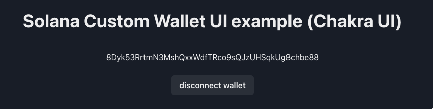
Clicking "disconnect wallet" simply calls disconnect and the wallet is disconnected and the wallet state is removed from local storage.
Conclusion
This guide went through how @solana/wallet-adapter-react-ui and then went over how to create a Connect Wallet feature in your React application simply using @solana/wallet-adapter-react and Chakra UI.
Check out the GitHub Repository if you want to take a look at the final code for this guide. You can also check out the deployed version - https://solana-react-wallet-adapter-custom-ui-example.vercel.app/
Now you can try to extend this by creating a modal or a multi-button with a nice dropdown to disconnect or change the wallet just like how the official React UI package does it, but with your styles of course.